Color Design in Fashion: The Art of Creating Popular Palettes
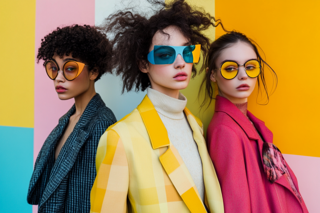
The journey of product development in the fashion industry begins with color design. Color plays a pivotal role in shaping the emotional response to a collection and influencing consumer purchasing behavior. Designers and colorists carefully select colors based on the predictions made by color forecasting companies, typically one to two years in advance. These colors set the tone for the season, with specific palettes forming the foundation of the collection. This process helps ensure that collections not only resonate with the current trends but also captivate the target market.
In this article, we explore the essential aspects of color design, including how color forecasting works, the process of selecting color palettes, and the naming conventions used for seasonal colors.
The Role of Color Forecasting in Fashion Design
Color forecasting companies play a key role in predicting which colors will dominate the fashion scene. They analyze various data points, including runway shows, consumer behavior, and cultural influences, to forecast color trends for the upcoming seasons. By offering seasonal color predictions, these companies help fashion brands ensure that their collections align with the market demand.
| Key Insights | Description | Icon |
|---|---|---|
| Trend Analysis | Color forecasting companies track fashion shows, street style, and industry reports to predict future color trends. | 🔮 |
| Consumer Behavior | Analyzing consumer preferences and sales data helps identify the colors that are expected to resonate with customers. | 🛍️ |
| Cultural Influences | Colors often reflect cultural shifts, societal events, and seasonal changes, influencing the palette selection. | 🌍 |
| Fashion Shows & Runway Trends | Designers’ color choices on the runway provide strong indicators for popular color selections in upcoming seasons. | 🎤 |
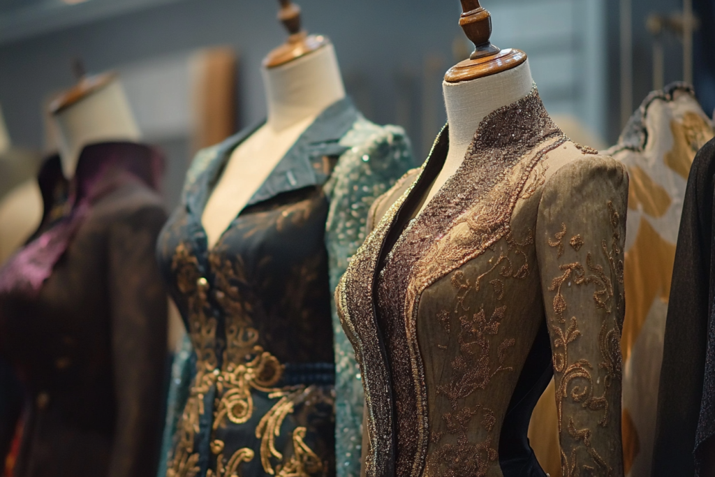
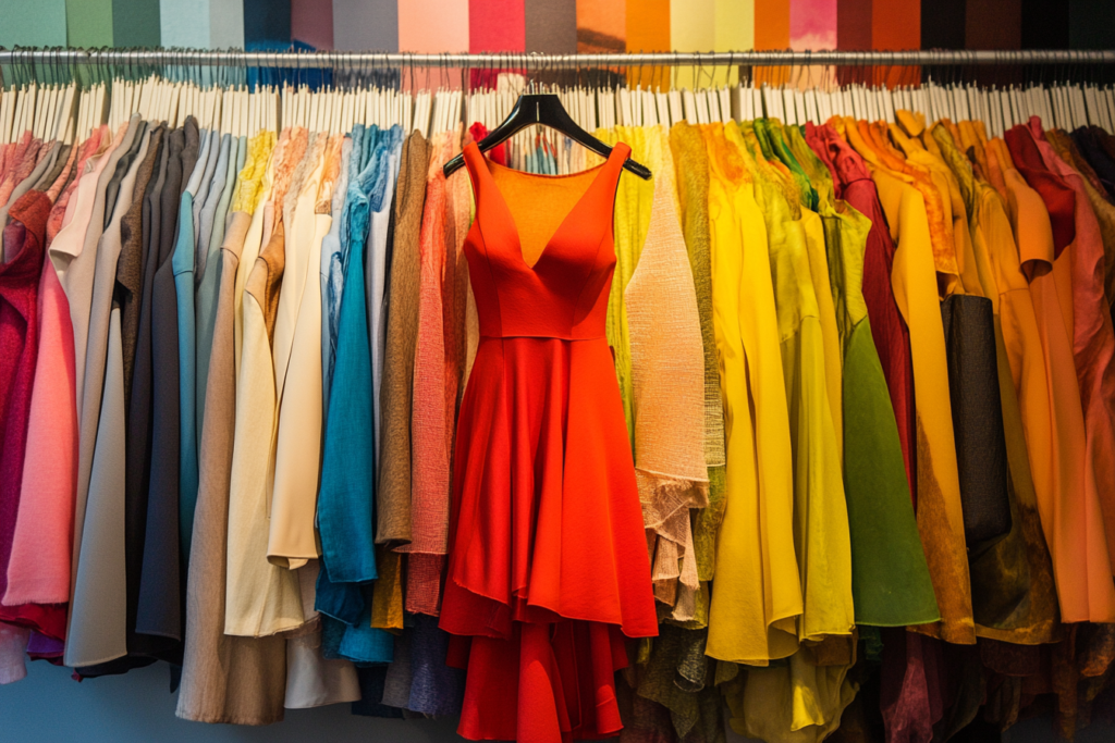
Understanding the Color Palette
A color palette is a carefully selected group of colors that align with the design theme for a specific season. Once the forecasted colors are identified, they are grouped into a cohesive palette that reflects the aesthetic and mood of the collection.
| Palette Component | Description | Icon |
|---|---|---|
| Base Colors | Core colors that anchor the collection. These are often neutral shades, such as black, white, or beige. | ⚫️⚪️ |
| Accent Colors | Bold, vibrant hues that add life and energy to the collection, often used in statement pieces. | 🔴🟢 |
| Highlight Colors | Subtle, lighter shades that provide balance and contrast to base and accent colors. | 🟡🟠 |
| Seasonal Colors | Colors predicted by forecasting companies based on the current and upcoming cultural and seasonal influences. | 🌸 |
Designers choose colors from these palettes to create a harmonious collection that appeals to the target audience while staying in tune with emerging trends.
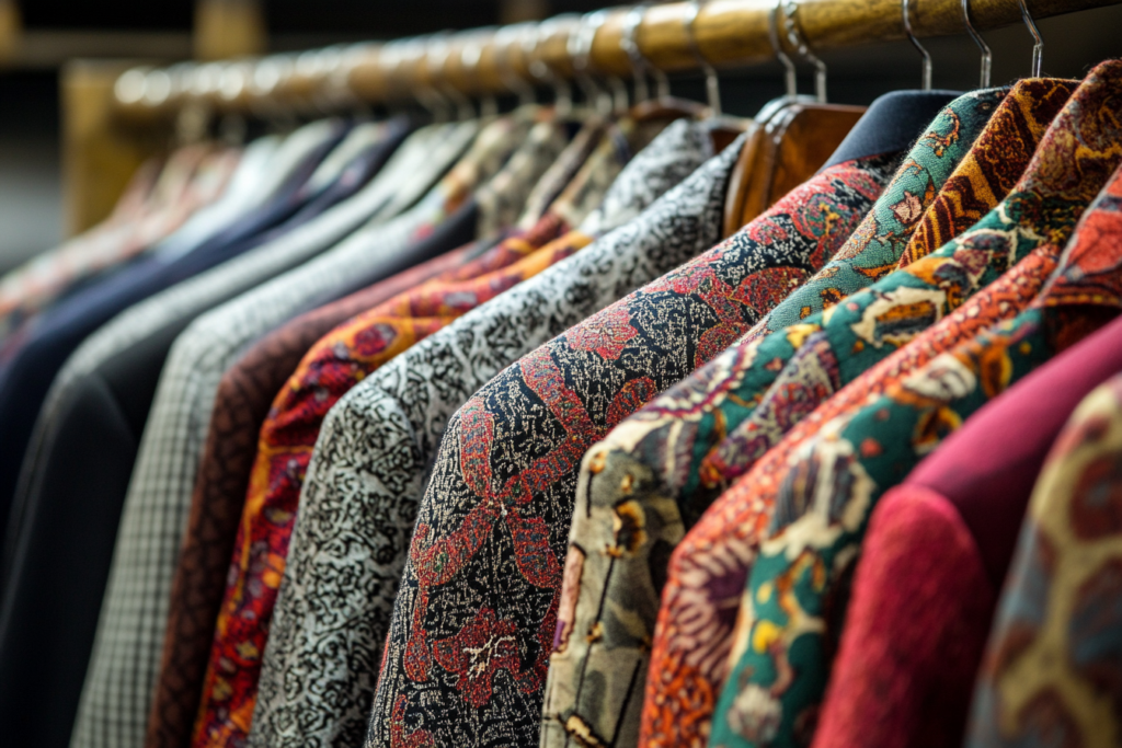
The Process of Selecting and Naming Colors
The process of selecting and naming colors for each season involves several key steps:
- Trend Forecasting: Designers rely on color forecasting companies to predict which colors will be in demand for the upcoming season. For example, spring collections might feature soft pastels or floral tones, while fall might lean towards rich, earthy hues.
- Color Naming: Once the colors are selected, they are given names that reflect the season’s theme, evoke a certain mood, or even relate to popular culture. For example:
- Rust vs. Iron Oxide: Different brands may choose distinct names for the same color to match their product positioning. One company might use “rust,” while another uses “iron oxide.”
- Quirky Names for Kids: Children’s clothing often features fun and playful color names, such as “apple green” or “blueberry blue.”
| Example Color Names | Seasonal Influence | Theme | Icon |
|---|---|---|---|
| Lip Color | Repeated from previous season, used due to high popularity | Spring/Summer | 💋 |
| Lavender | Fresh and floral, reflecting a spring vibe | Spring | 💐 |
| Bamboo Color | Earthy and neutral, trendy for nature-based themes | Fall | 🎋 |
| Honeycomb Color | Sweet and subtle, with a warm undertone | Fall/Winter | 🍯 |
The choice of names not only reflects the color but also ties into the brand’s theme for the season, ensuring that consumers can easily connect with the products.
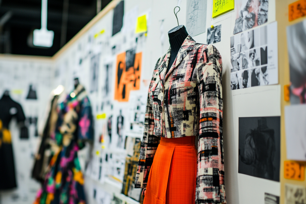
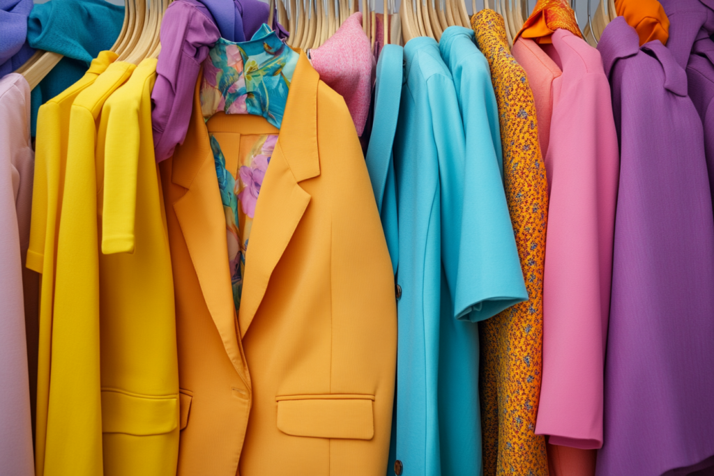
Seasonal Themes and Color Trends
Each season’s color palette is aligned with a theme that captures the essence of what’s happening in the world at that time. For example, the theme for Spring 20XX might focus on “Outdoors,” featuring fresh, vibrant colors inspired by nature. These colors are selected to evoke feelings of renewal, growth, and vitality—perfect for the spring season.
| Season | Color Palette & Trend | Icon |
|---|---|---|
| Spring 20XX | Outdoor-inspired colors: soft lavenders, bamboo, honeycomb yellow, black and white. | 🌸🟢 |
| Fall 20XX | Earthy tones such as rust, mustard yellow, and rich browns. | 🍂 |
| Winter 20XX | Bold jewel tones and deeper hues like emerald green, sapphire blue, and charcoal. | ❄️🟣 |
| Summer 20XX | Bright, energetic colors like coral, turquoise, and tangerine. | 🌞🟠 |
By adhering to these seasonal themes and colors, fashion brands create collections that resonate with consumers’ moods and needs during specific times of the year.
Color Popularity and Sales Performance
One of the most important aspects of color design is understanding how previous seasons’ colors have performed in the market. Companies closely monitor how well certain colors sell and may bring back popular hues for subsequent seasons.
For example, if the lip color from the previous season has been a huge hit, it may be included in the next collection, either as-is or with slight modifications to reflect new trends.
| Color | Seasonal Popularity | Sales Insights | Icon |
|---|---|---|---|
| Lip Color | High demand in Spring/Summer | Widely popular, continues to drive sales volume. | 💄 |
| Lavender | Trending for Spring 20XX | Gaining popularity, fresh and calming vibe. | 💜 |
| Honeycomb | High demand in Fall | Warm and earthy, performing well in colder months. | 🍯 |
| Emerald Green | Popular for Winter 20XX | Strong sales performance in luxury collections. | 💚 |
The Importance of Color Design in Fashion Success
Color design is a key element in product development, as it plays a significant role in how consumers perceive and connect with fashion collections. By carefully selecting colors based on forecasting reports, market trends, and seasonal themes, designers can create collections that are both appealing and relevant. Through color palettes, trend forecasting, and strategic naming, fashion brands can set the tone for the season, ensuring that their collections are in line with consumer expectations and market demand.
The strategic use of color can elevate a brand, enhance consumer loyalty, and significantly drive sales, making it an essential tool in the world of fashion design.